
Prepare Manuscript Files: Margins, Bleeds, Spine Widths

How Long Does It Take to Print a Book? Understanding Turnaround Times
August 25, 2026
Do You Need an ISBN to Print & Sell Your Own Book in Canada
September 7, 2026Prepare Manuscript Files: Margins, Bleeds, Spine Widths
Before you send a manuscript to print, the single most important step is making sure the file itself is built for the physical page. A Word document that looks fine on screen can shift, clip, or disappear when it hits a professional press, because screen view and print layout use different rules. Understanding how to prepare your manuscript files for professional book printing—especially margins, bleeds, and spine widths—prevents the most common and costly mistakes.
We see the same preventable issues in files from first-time authors and experienced publishers alike: text too close to the edge, images that stop short of the trim, and a spine calculation that leaves the cover text wrapped around the corner. This guide walks through the file decisions that matter before production, from initial formatting to the final pre-press check.
Essential Manuscript Formatting for Professional Book Printing
Choosing the Right File Format
We almost always ask for a DOCX file rather than a PDF. A DOCX keeps text editable, style tags intact, and allows us to adjust trim size, margins, and pagination without rebuilding content. PDFs lock layout and often carry embedded font issues or missing bleed settings. Export from Word, Google Docs, or LibreOffice as .docx. Use simple file names like BookTitle_Manuscript.docx.
Applying Consistent Text Styles
Use one font family (Times New Roman, Arial, or Calibri) at 11 or 12 point for body text, with headings a point or two larger. Avoid multiple fonts, manual bolding, and extra spaces. Set line spacing to 1.5 or double for manuscript review, but note that final book layout will change spacing and font; the key is a clean, predictable hierarchy. Use Word’s built-in heading styles for chapter titles and section breaks, not manual formatting. That allows us to map styles to the final design.
Structuring Your Document Correctly
Keep front matter, body, and back matter in order. Use page breaks between chapters, not multiple enters. Mark scene breaks with three asterisks or a hash symbol. Label chapters consistently (‘Chapter 1’ or ‘Chapter One’ throughout). Do not add page numbers, headers, or footers—we handle those in layout, and manually inserted pagination can shift.
Ensuring Language Accuracy
Set the document language (American, British, Canadian English) before spell check. Run grammar and spell check, but review suggestions critically, especially for technical terms. Add unique names or terms to the dictionary to catch inconsistencies. Consistent spelling and hyphenation prevents layout rework.
Preparing Visual and Special Elements for Professional Book Printing
Optimizing Images and Graphics
If your book includes photos, illustrations, or charts, provide them as separate high-resolution files, not embedded low-res screenshots. For print, images need at least 300 DPI at the size they will appear on the page. A 72 DPI web image will look blurry. In the manuscript, include a placeholder line like [INSERT IMAGE 1 HERE] with a caption, and send the actual image files separately with matching names (Image1.jpg, Image2.png). Do not compress images heavily.
Handling Special Text Elements
Tables, sidebars, poetry, lyrics, footnotes, and other special elements need clear marking. If you have poetry, preserve line breaks as you want them. For tables, keep them simple in Word, and use Word’s footnote feature rather than typing note numbers manually. Bullet points and numbered lists should use Word’s list tools, not manual dashes, so they can be styled consistently. If you have text messages or email excerpts, mark them clearly with a label like [TEXT MESSAGE] so we can apply a distinct style.
Mastering Technical Layout: Margins, Bleeds, and Spine Width for Professional Book Printing
The physical page is where most file problems surface. Screen view doesn’t show the trim edge, the binding curve, or the fold, so we always check three numbers before approving files: margins, bleeds, and spine width.
Understanding and Setting Margins
In a printed book, margins are the safe area between your text and the trimmed edge of the page. Set margins in your word processor to at least 0.75 inches on the top, bottom, and outside edges, and 1 inch on the binding edge (the inside edge). That extra inside margin, often called a gutter, accounts for the curve of the page near the spine and keeps text from disappearing into the fold. If you are preparing a manuscript for initial editing, 1-inch margins all around are standard and easy to read. During final layout, we may adjust margins to fit your trim size, but the binding-side gutter must never be below 0.75 inches for a book over 100 pages.
Incorporating Bleeds for Edge-to-Edge Design
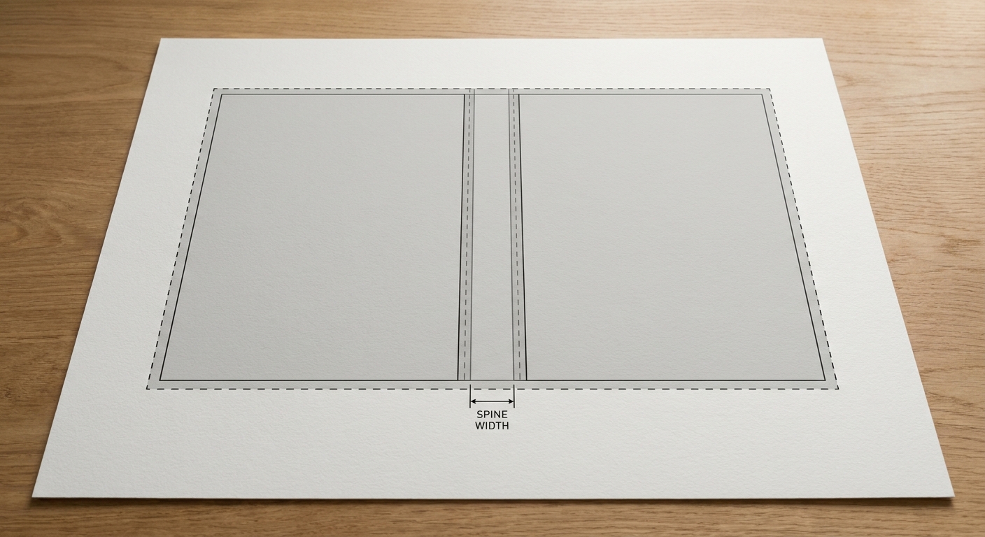
A bleed is the part of a design that extends past the trim line, so when the book is cut, there is no white sliver at the edge. If your cover, chapter openers, or any page has a background color or image that reaches the edge, you must include bleed. Standard bleed is 0.125 inches (3 mm) on all sides that are trimmed. In your manuscript file, don’t try to add bleed manually; instead, tell us which elements need to reach the edge and provide the original graphics with extra canvas. For the cover, the design file must be set up with bleed in the design software, not just the text file. When we receive a PDF without bleed, we have to rebuild or stretch the design, which changes the final appearance.
Calculating Spine Width Accurately
The spine width is the thickness of the book block at the binding edge. It is not a guess: it depends on the exact number of pages and the paper stock. To calculate it, we need your final page count (including all front and back matter) and the paper specification. The formula is: total pages divided by 2, because each sheet has two pages, then multiplied by the thickness of one sheet. But rather than measuring paper yourself, send us the final page count and paper choice, and we will give you the exact spine width for the cover design. Even a 10-page difference can shift the spine by several millimetres, so do not design the cover until the page count is locked.
Since 1993 we have produced bound books and manuals for clients ranging from small businesses to high-volume operations, and that experience shapes how strictly we review file setup before any job reaches the press.
Final Steps: Pre-Press Checklist and Submission
Comprehensive Pre-Press Checklist
Before you send your files, run through this list. Then we’ll do our own pre-flight check, but your review catches errors early and keeps the schedule on track.
- Proofread the entire manuscript; do not rely on the editor to catch final typos after layout.
- Confirm front matter, body, and back matter are all present and in order.
- Accept all tracked changes and delete all comments in Word.
- Remove manual page numbers, headers, and footers.
- Check that all chapters are numbered consistently and that no placeholder text remains.
- Verify that all images are at least 300 DPI and sent as separate files with clear names.
- Confirm that any text meant to reach the page edge has been flagged for bleed.
- Lock the final page count and paper stock, then ask us for the spine width before finalizing the cover.
When the file setup is correct, the press run is predictable. If you want a second set of eyes on your manuscript before printing, send us the DOCX and a list of any special elements, and we’ll review it for layout risks.